
Choosing the Film to Shoot the Tour of Britain
Film Choice Was a Big Decision Shooting the Lloyds Tour of Britain Men
You make the crazy decision to shoot the Tour of Britain on film with vintage cameras and lenses, you plan your days, visualise your shots and cross your fingers, but what ‘look’ do you want your photos to have?
If you’ve always shot digital, or have forgotten what it’s like to shoot on film, you’ll maybe not be familiar with the unique look, style and feel of different film stock. Beyond the obvious choice of colour or black and white, every film produces unique characteristics which influence your approach and dominates the appearance of your images.
Colours are rendered differently, contrast is raised or reduced, grain is introduced and structured individually, exposure latitude varies, etc, etc.
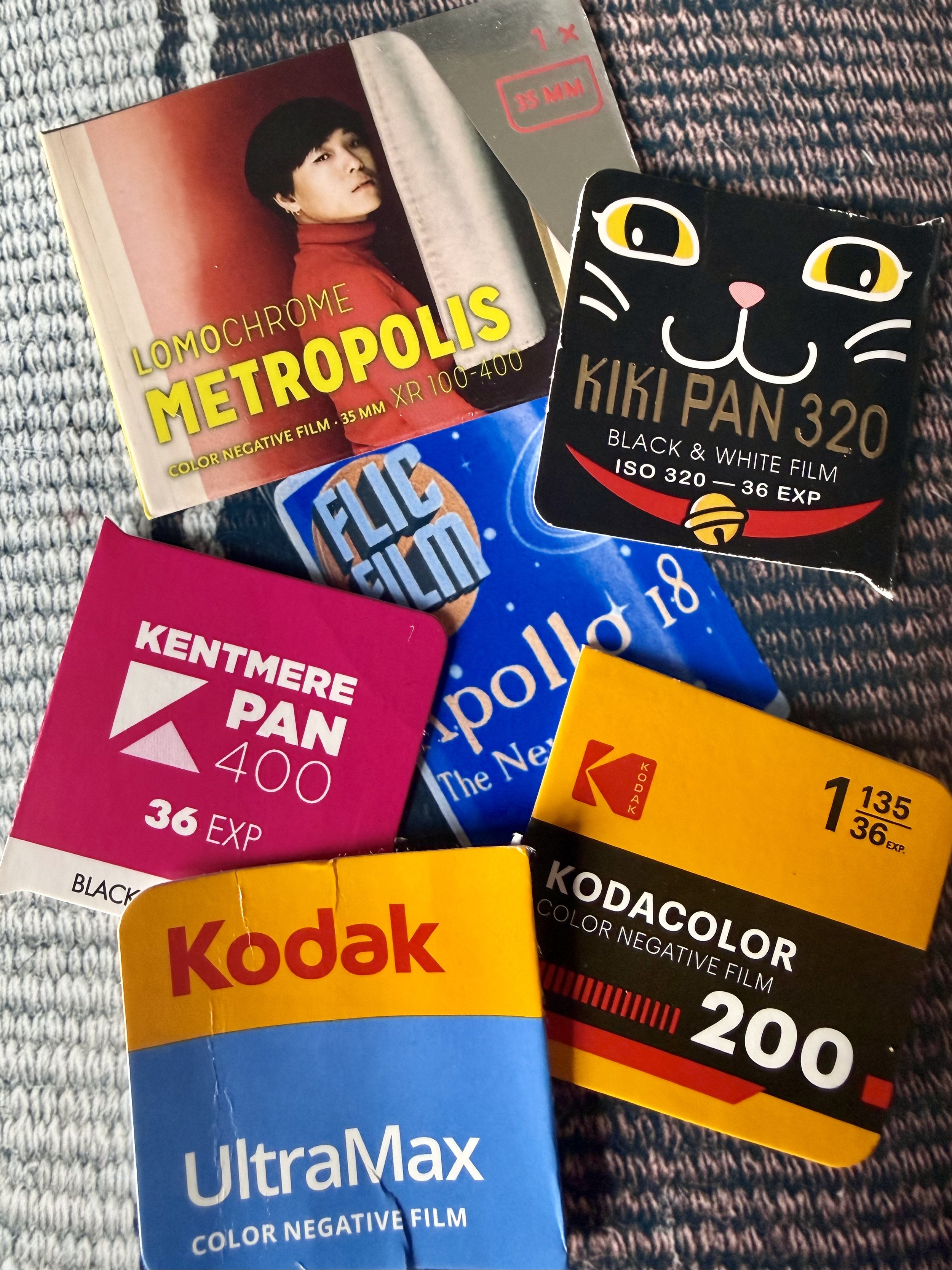
I sat down with Ross from Not Quite North Camera Shop and Film Lab who sponsored me for this project, and together we chose a range of films to shoot this project on.
In this blog I’ll take you through those choices, discuss the reasons and the effect they had on my photography and images produced.
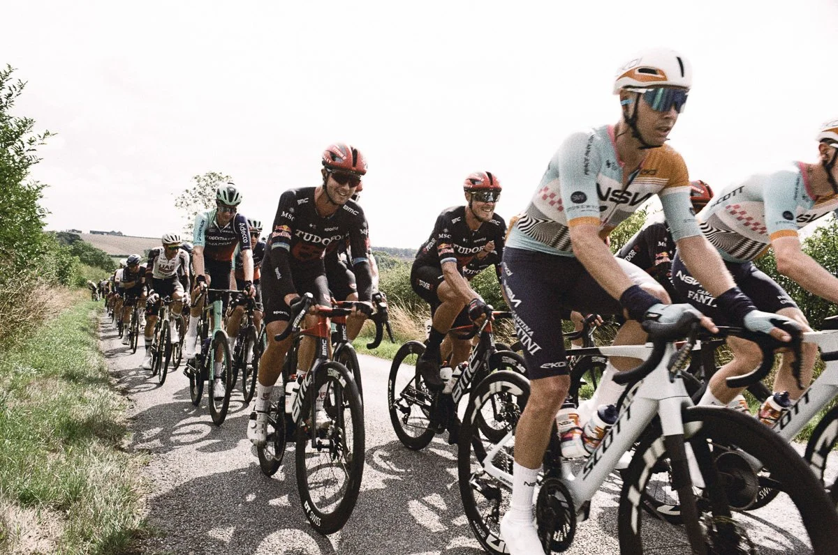
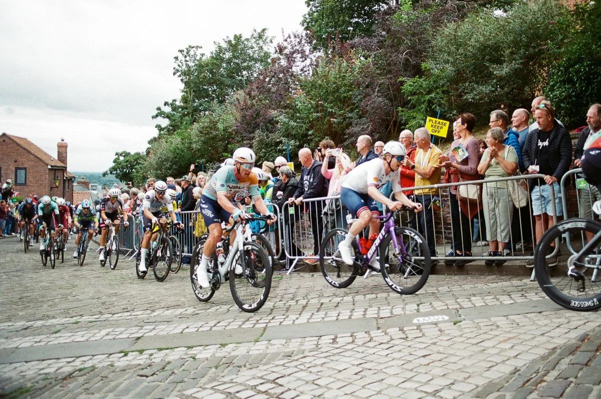
Six Films, Six Different Styles - A side-by-side comparison of the six different films I used at the Tour of Britain
Decision Making
I’m regularly asked by people who see me shoot on film if “film is still available to buy?” - absolutely it is and, in many ways, the choices are greater, and clearer than ever!
Whilst we can easily edit our digital RAW files and apply numerous styles, film makes you plan ahead, choose a look for the anticipated conditions, set the technical boundaries and, ultimately, live with the results.
Some of the considerations for my film choices were therefore;
Weather is always a significant influence in any outdoor photography assignment but becomes the principal concern when shooting on film. All cameras need light but without the adjustable ISO of a digital camera the selection of the film’s speed (ISO) is crucial to ensuring it can make the most of the available ambient/day light.
Speed is not limited to the speed of the film and available light however. Rapid sports like cycling require shutter speeds of 1/500th to 1/1000th sec to capture the action so it’s highly likely that, even on sunny days, only a high speed (ISO) film will give you that range.
Colour. If, like a cycle race, your subject is colourful then you’re going to have to work hard to replace the colour interest in your images with something else if you choose a black and white film or another that de-saturates colours. Some films will saturate or enhance individual colours whilst muting others and if you’re shooting with artificial light you have to anticipate the colour of the ambient light as well as your subject.
Subject will usually give you a good indication of a style to pursue, textured, slick, colourful, bright etc etc.
Sport usually creates a colourful environment, one that often dominates people’s view of it, and so with a couple of exceptions I wanted to shoot with colour film. Colour is reproduced very differently by various films and it’s rendering is extremely subjective, the point of contention for many heated debates!
Personally I prefer a cooler and more ‘natural’ look to my colour photography, avoiding high saturation or colour shifts unless for a particular subject or style.
Having said all that I’m a big fan of black and white and always happy to seek out some alternatives with a roll or two of black and white film.
With a plan for the three days of shooting made, the weather looking good at least after the start of day one, we pulled together a small collection of film. We chose a slightly unconventional line up for day one, with the confidence that we had two further days to explore the more routine choices;
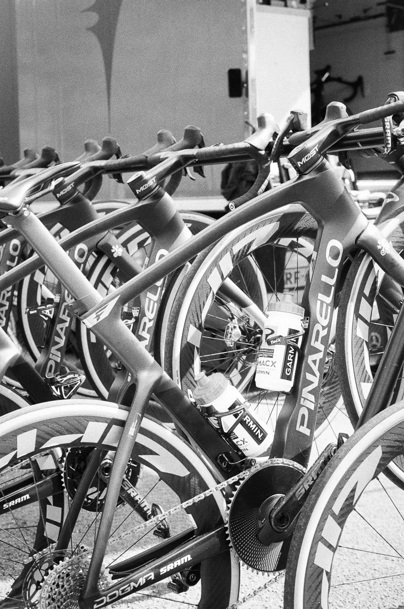
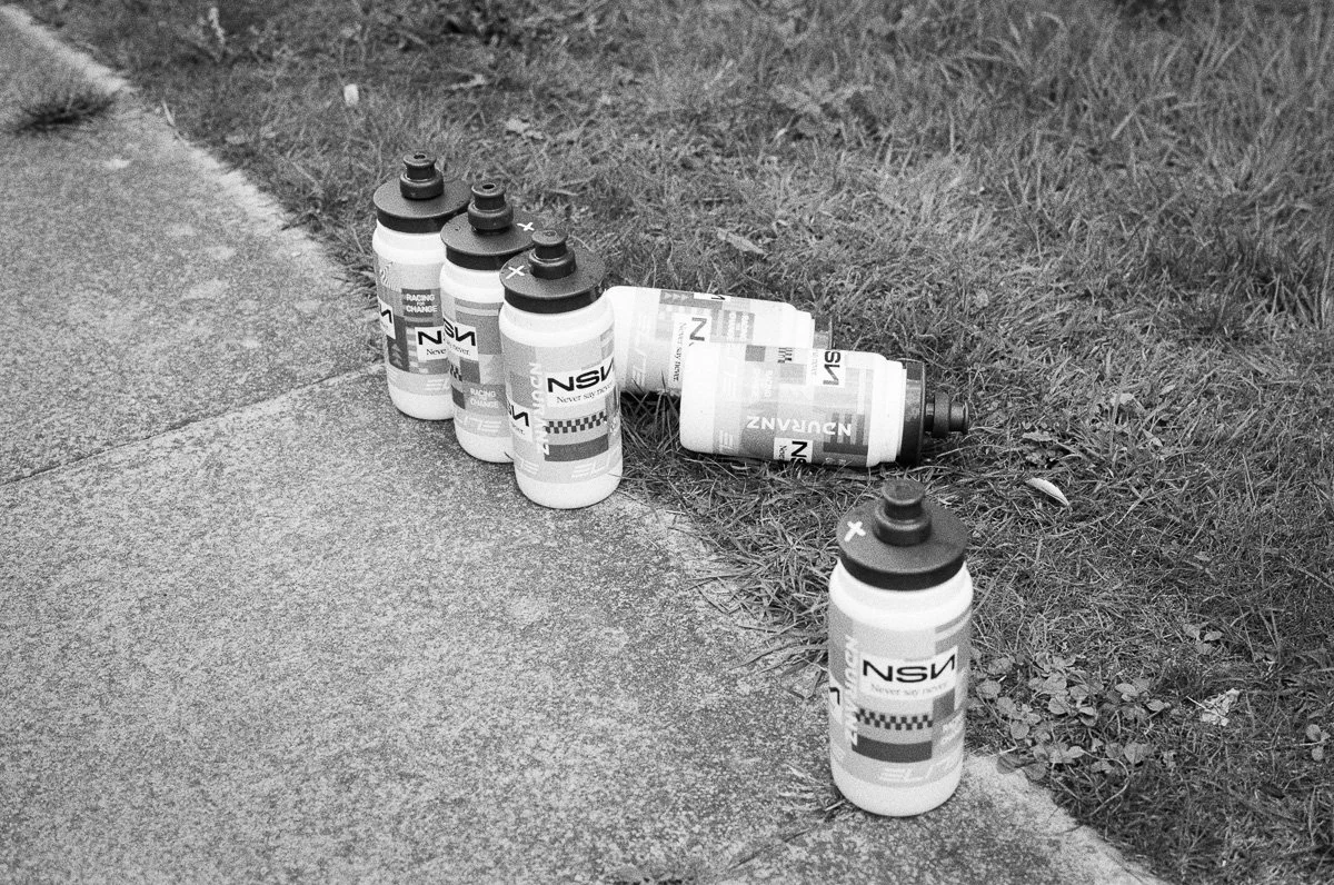
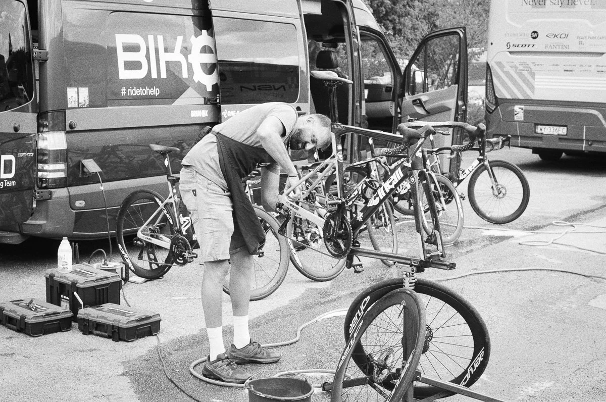
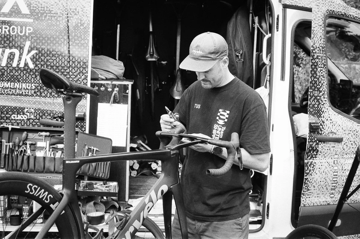
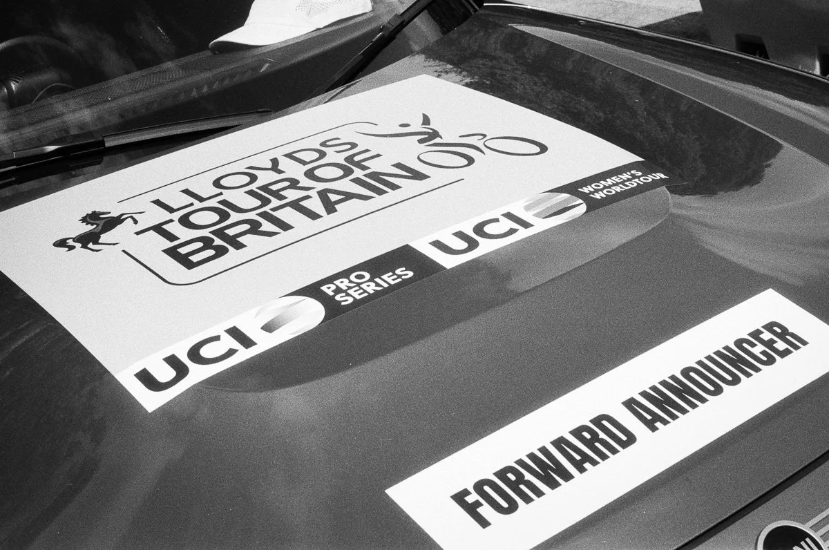
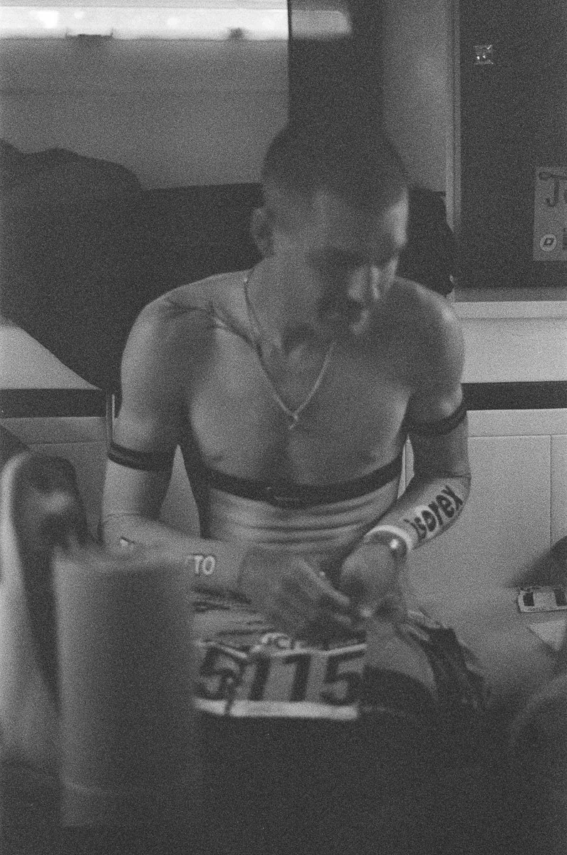
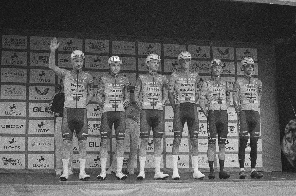
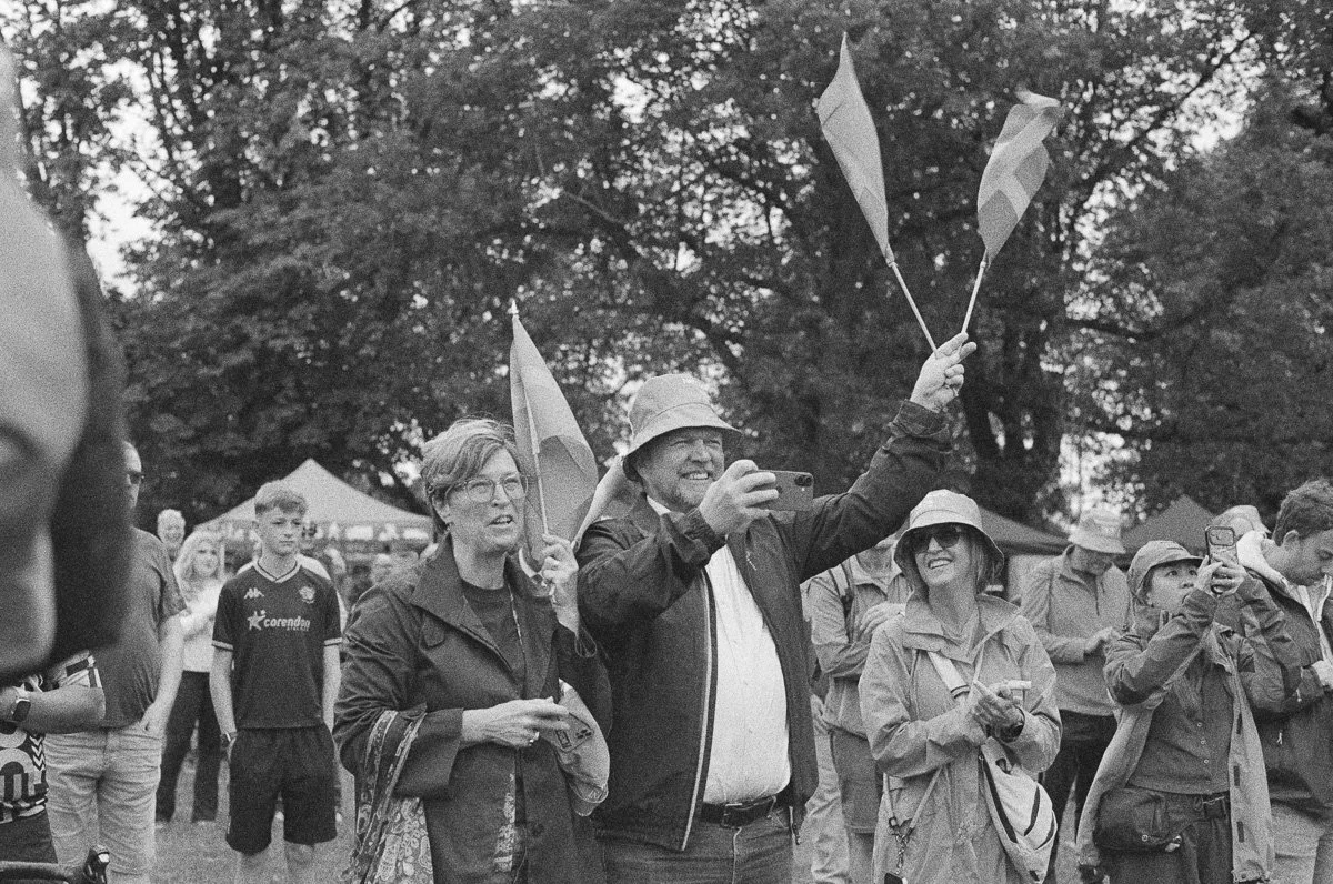
Kentmere Pan 400 Black and White is often classed as a ‘budget’ alternative to the iconic Ilford HP5 but I find it to be a little more forgiving, lower contrast and, in good lighting, producing a smoother grain for details. It’s quite a ‘safe’ choice producing sharp images with a wide dynamic range and I only used one roll when shooting a couple of team’s preparations the day before the race began.
Lomochrome Metropolis 400 was a new colour film to me, recommended by Ross as ‘film-noir’ style with colour. With muted tones but reds and oranges popping and heightened contrast, it might match the first day’s overcast lighting with Lincoln’s gothic Cathedral backdrop a match for it’s gritty, grungey mood. My only concern was the tendency for skin tones to lean towards the blue-magenta, but cyclists cover their faces with big shades anyway!
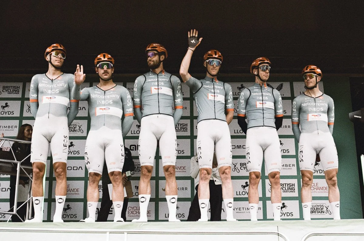
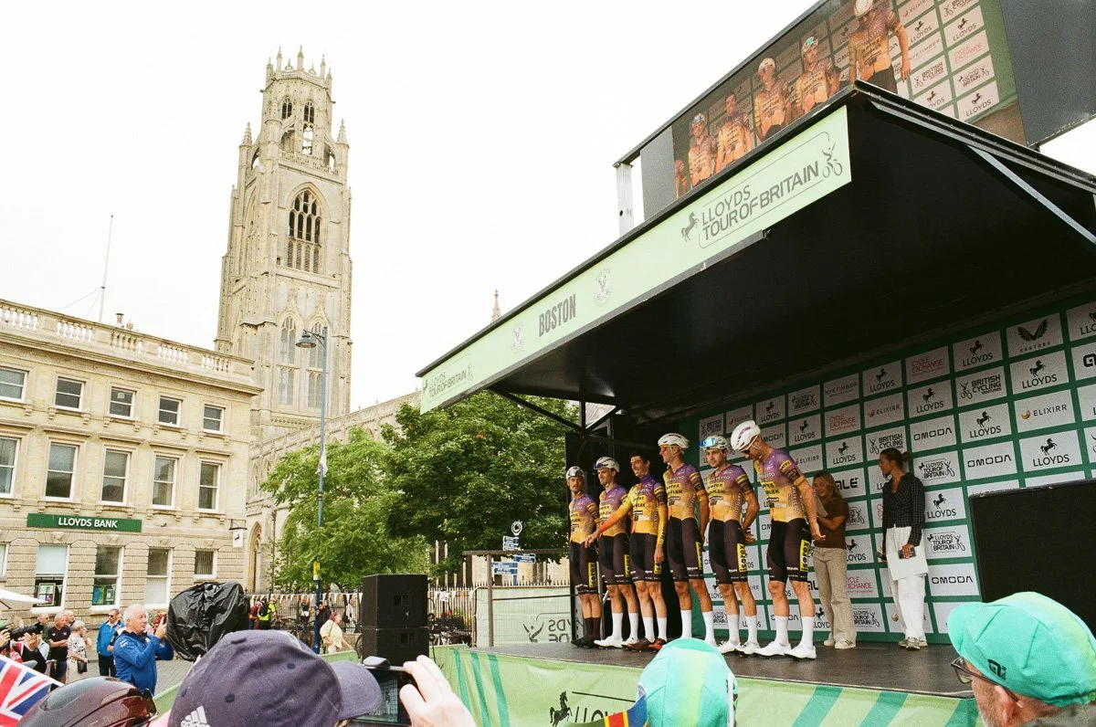
Flic Film Apollo 18 came out of the left field, or Ross’s imagination, but was a genius choice. It’s a sharp grained 400 ISO colour film with subtle warm tones giving photos a nostalgic and vintage memory style feel, not your obvious first choice for a bike race. As a side note Apollo 18 is primarily aimed at half frame camera users, containing only 18 full frames per roll, so I was very conscious of the shots I was lining up.
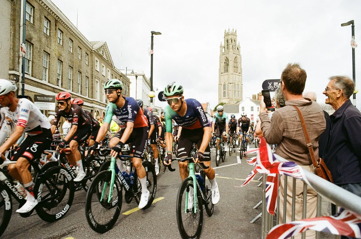
Kodak UltraMax 400 colour film is a very dependable and versatile colour film with natural colours, equally saturated, if maybe a little on the cool side. For a 400 speed film it has a very fine grain which is largely indistinguishable from slower film in good lighting conditions. A couple of rolls for day one were my ‘safe bet’ for neutral but saturated colours of riders and spectators, especially when things moved fast towards the end of the stage.
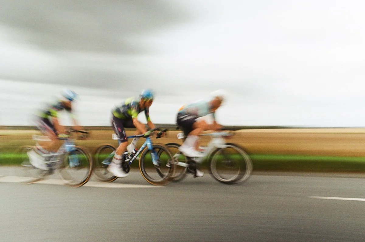
KodaColor 200 is a similarly dependable colour film, with fine grain and neutral colours (especially in good natural light) that I was happy to move to on days two and three when I knew we’d successfully ‘experimented’ with some alternative looks. I especially wanted to introduce some panning into my shots and the 200 speed assisted when lowering the shutter speed.
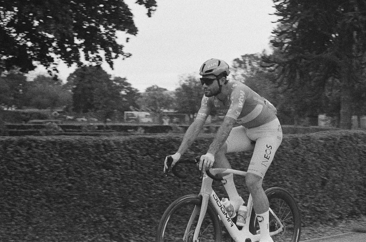
Kiki Pan 320 black and white was another new film to me and again recommended by Ross. A little of an unknown it promised strong grain, sharp contrast and a lot of character.
Kodak vs Kodacolor
If you shoot film in the UK or follow broad photography news updates you’ll be aware of changes, or additions, to Kodak film stock. In 2025 Kodak announced the ‘return’ of the KodaColor brand with “new” film, Kodacolor 100 and 200. Initially the suggestion was that KodaColor was an improved emulsion, enhanced colour, finer grain etc and much debate amongst photographers has followed. Now the announcement has settled down and supplies for the ‘new’ film have stabilised in the UK it’s clear that this is simply a rebrand of existing film, and Kodak have even gone on to repackage their remaining film varieties (Ektachrome, Gold etc) with matching designs.
And after the headlines for “new film” disappeared, Kodak themselves used the strapline “New Look. Same Great Film.” on their own website!
Put simply Kodak ColorPlus 200 is now Kodacolor 200 and Pro Image 100 is now Kodacolor 100.
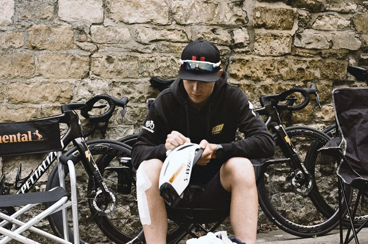
Day 0 - Kentmere 400
The day before the race was a set-up, preparation day for everyone, including me. Whilst collecting my official accreditation I grabbed a handful of shots of the mechanics setting things up, with a roll of Kentmere 400. Entirely predictable, reliable results with sharp images and noticeable, but smooth, grain in good natural light. Just warming up for race day.
Day 1 - Apollo 18, Metropolis 400 & UltraMax 400
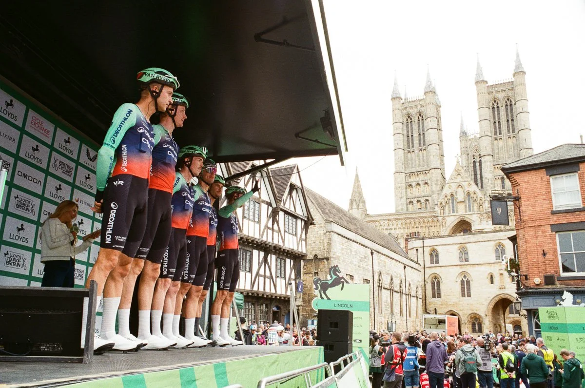
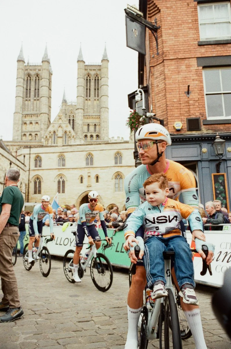
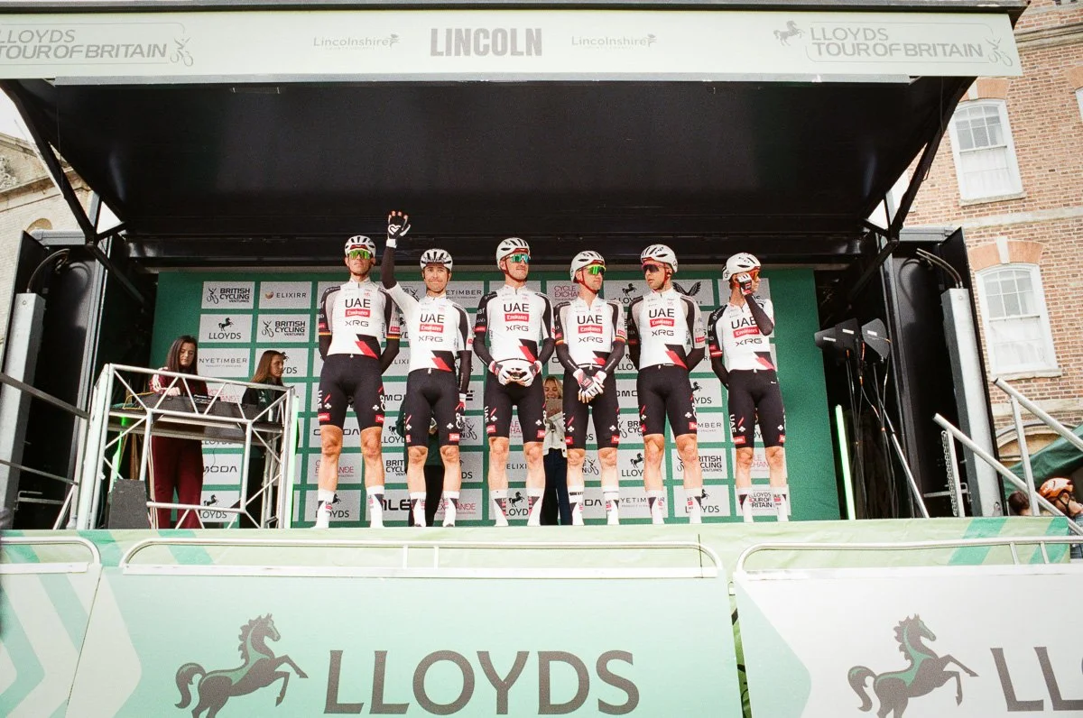
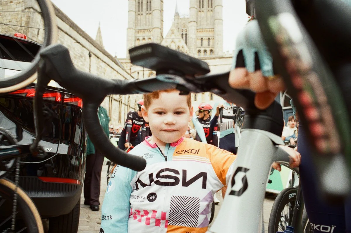
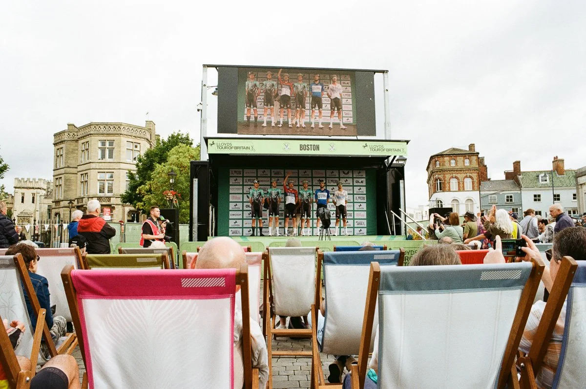
I kicked off with the roll of Flic Film Apollo 18, shooting the team presentations with a 25mm lens. I didn’t know what to expect from this film but I was delighted watching the images appear on the scanner in the evening. It has an unmistakable film look but is sharper than I expected, grain showing up in the shadows but I was blown away by the colour, beautifully muted but with primary colours subtly saturated. I wasn’t prepared for the wonderful skin tones though, the image of the rider’s small child was a true fortuitous moment where I had no time to swap cameras, the quality the film has produced here was really surprising, I even checked the negatives to make sure I hadn’t mixed up the film!
I’ve printed a couple of these shots at A4 size and am confident that the grain and texture of the film will remain smooth even in larger prints.
I’ll definitely be using Apollo 18 again but next time I’ll be a little more careful with my exposure, it seems it has a narrower dynamic range and some of my back-lit images are a little dark despite losing the detail in the highlights.
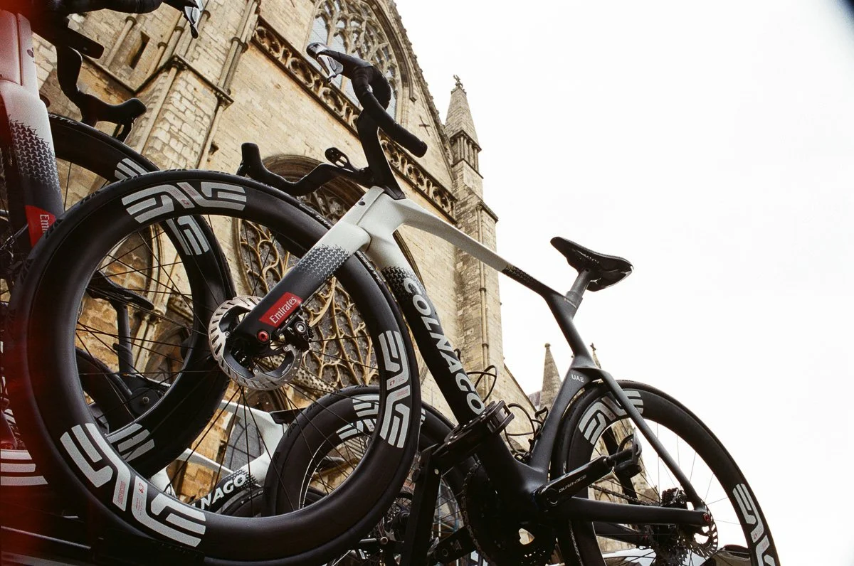
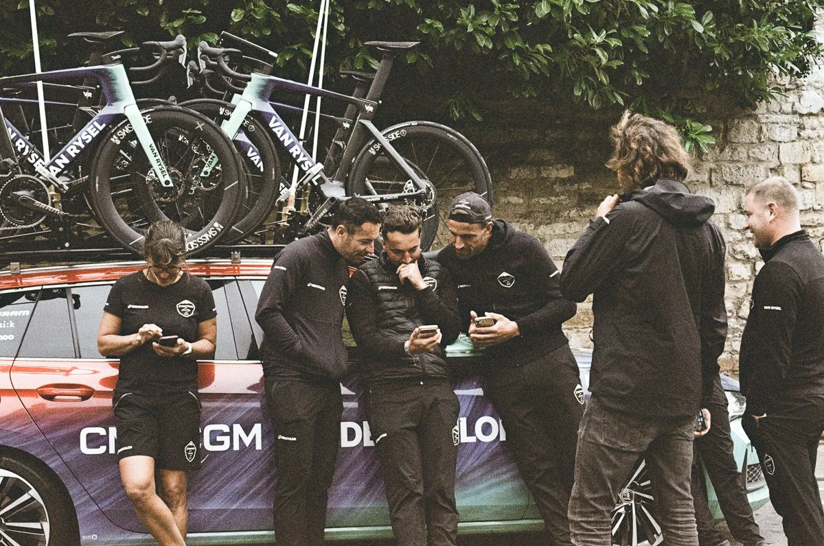
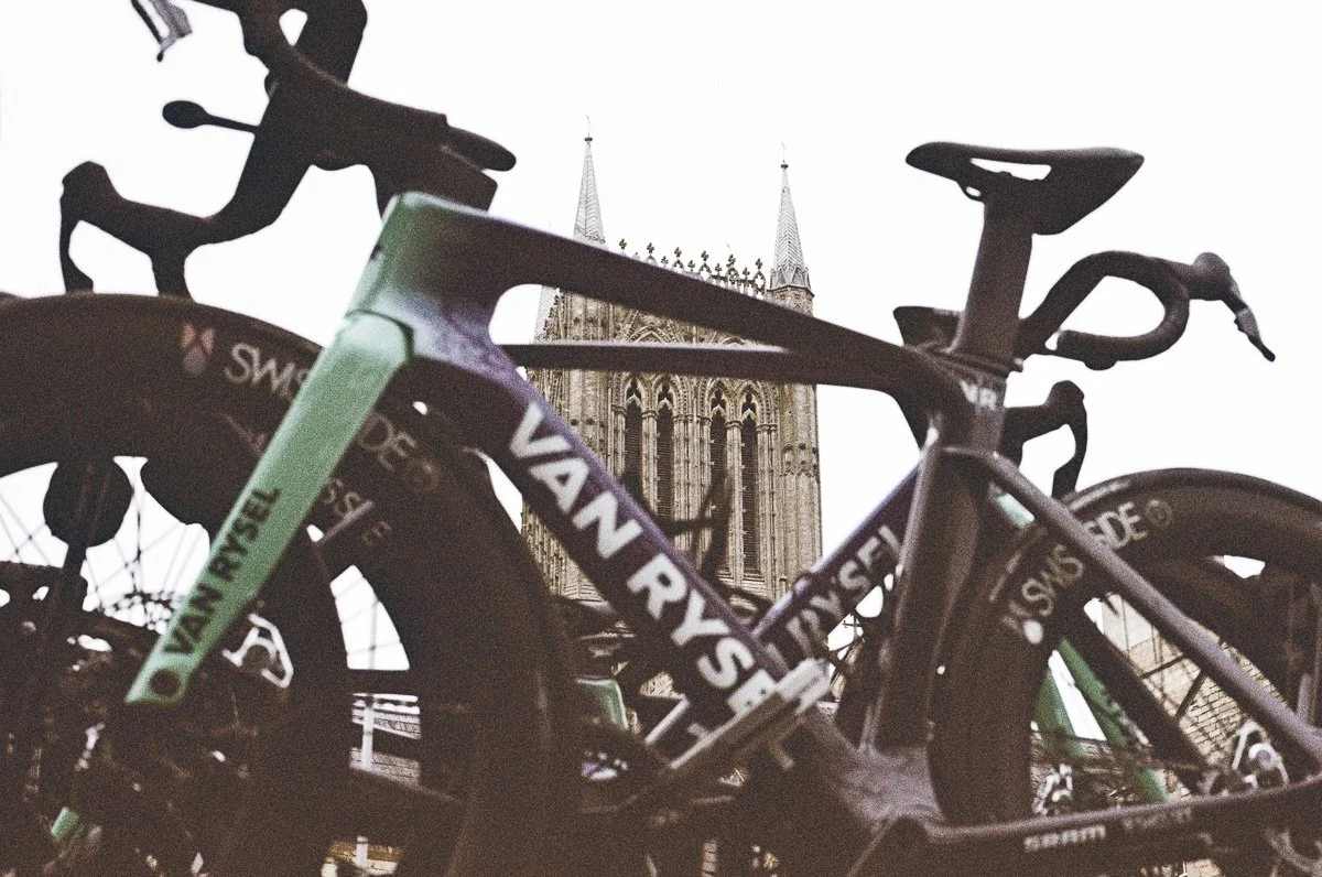
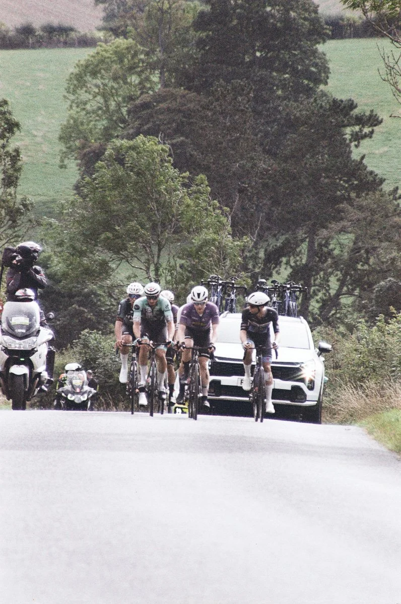
I shot two rolls of Metropolis 400, pre-race and then as I chased the race across the Lincolnshire Wolds with the weather improving.
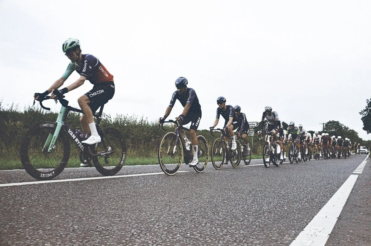
The first examples illustrate it’s gritty, muted tones and reflect the overcast conditions in the morning. The film displays it’s sharp grain in all conditions but it’s contrast is most noticeable in bright sunlight.
The ‘film-noir’ style suits the early, detail shots with a dark mood to them, it might illustrate how some films suit a particular subject but I have a nagging feeling I didn’t get the best out of it. The shot of the race passing right to left was made as I tried to catch-up around road closures, it wasn’t the shot I’d planned, and may be more about my rushing than the film’s low tolerance, but I do wish I’d increased my exposure against the bright sky. The subsequent shots are better exposed as the race passes me, they have an edge and a vintage feel that warrants more exploration.
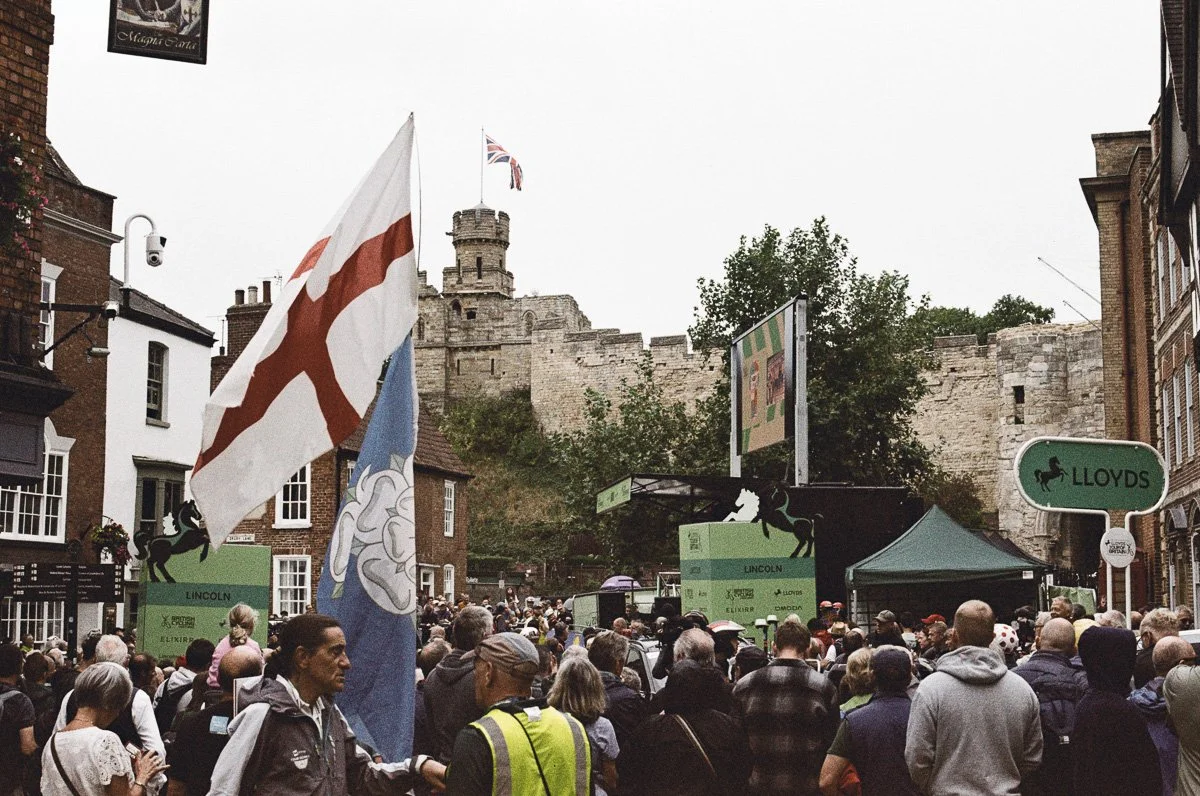
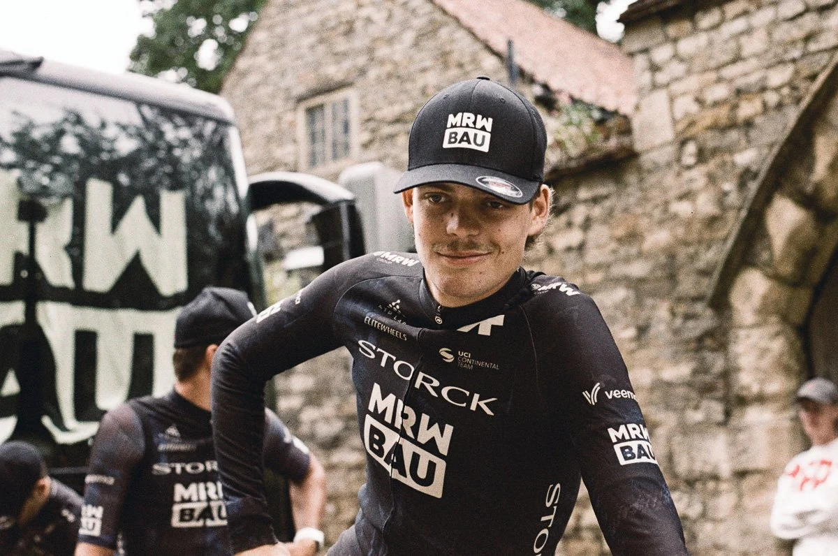
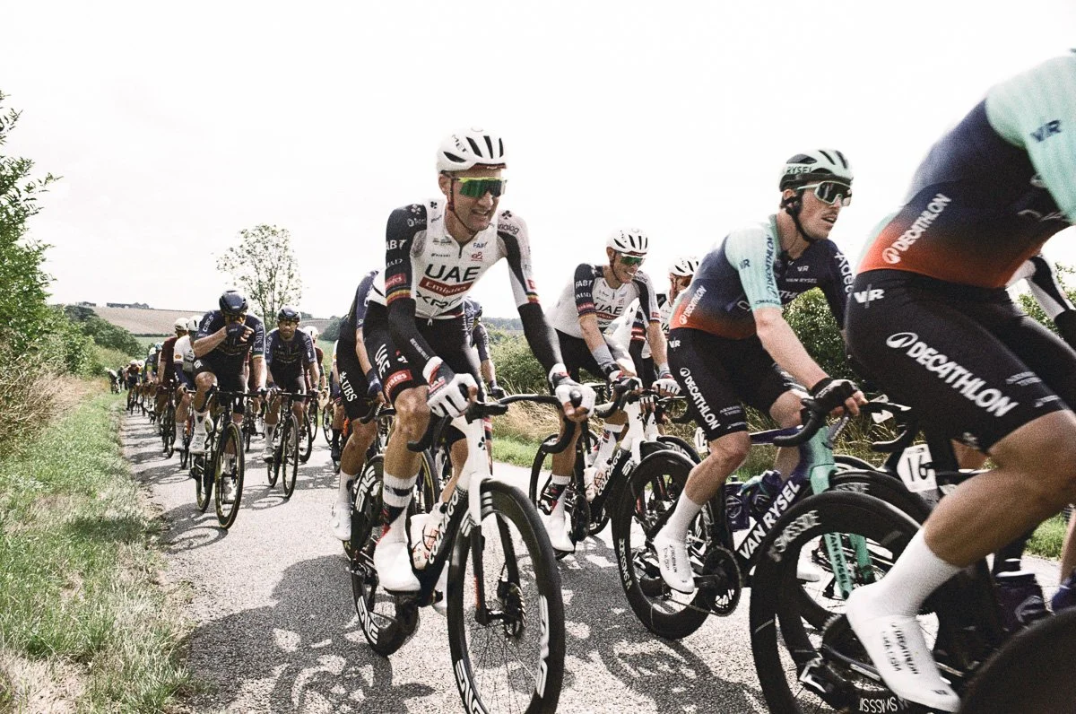
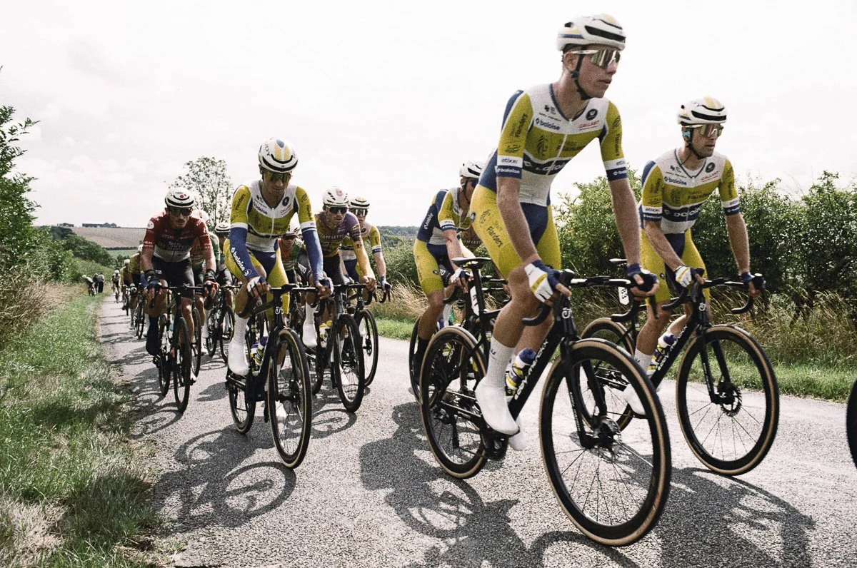
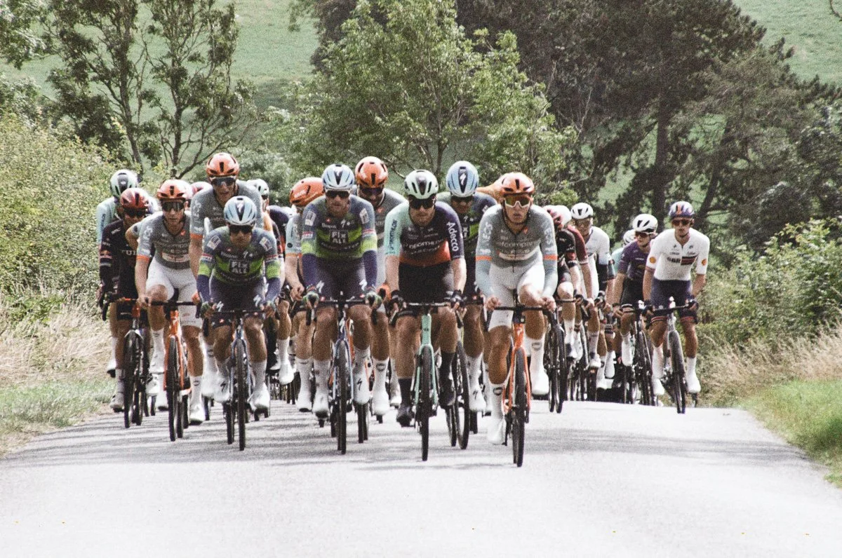
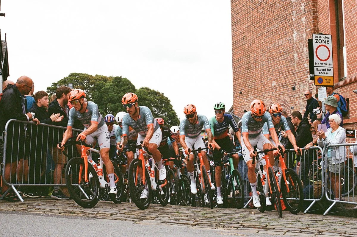
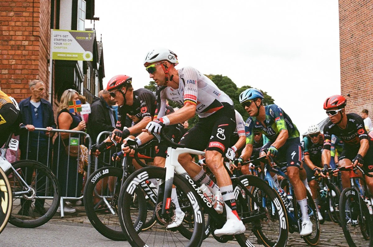
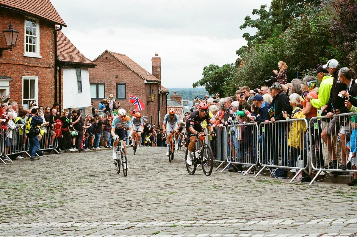
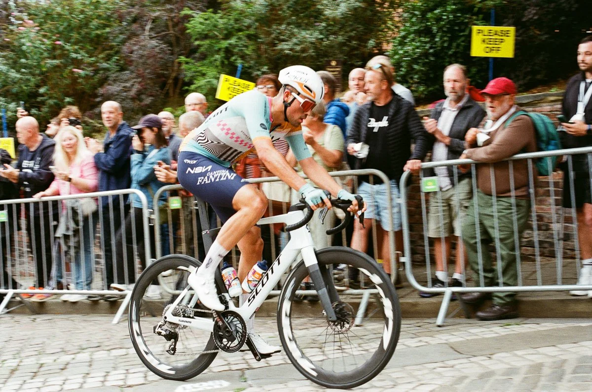
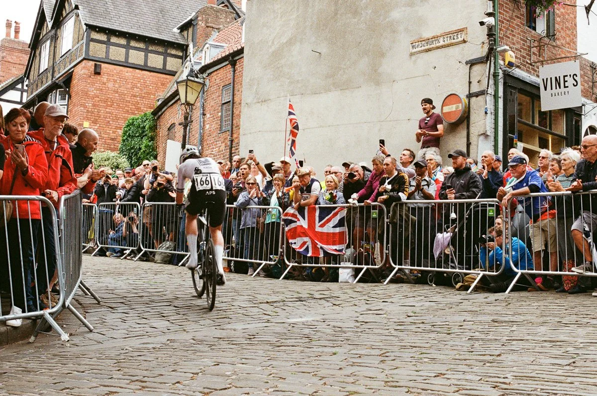
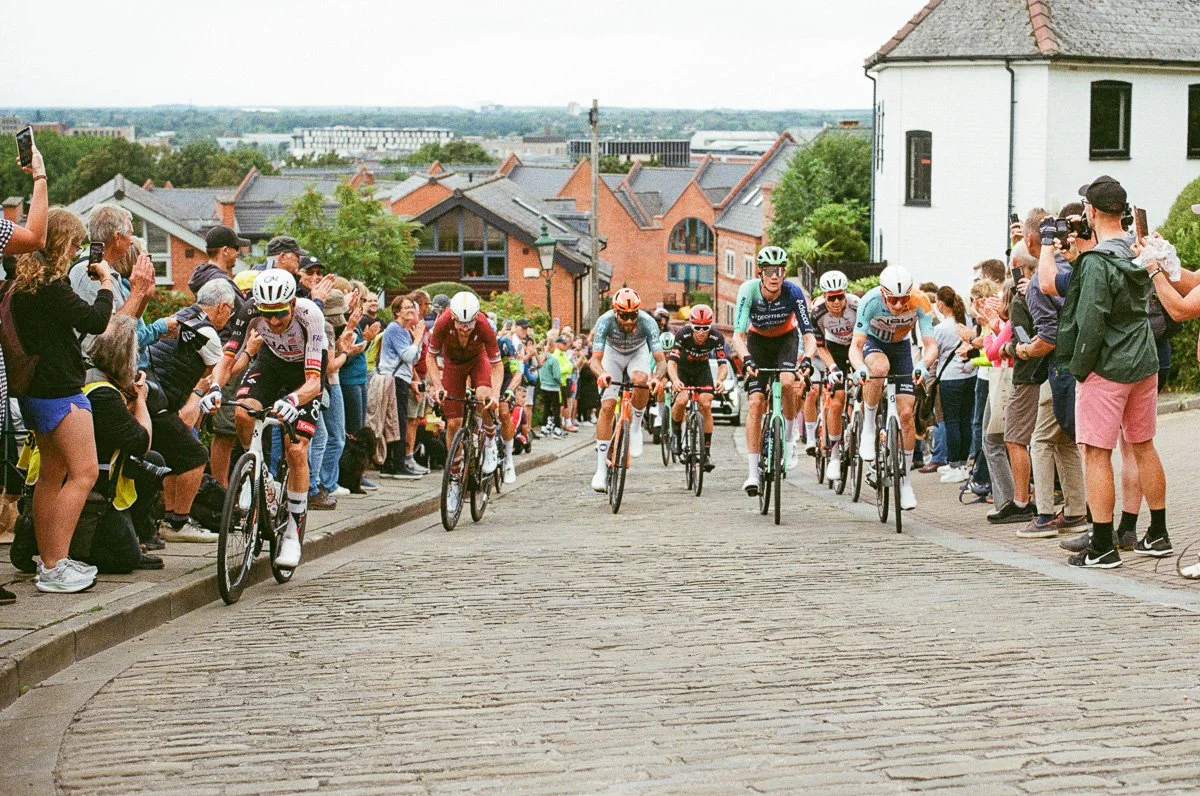
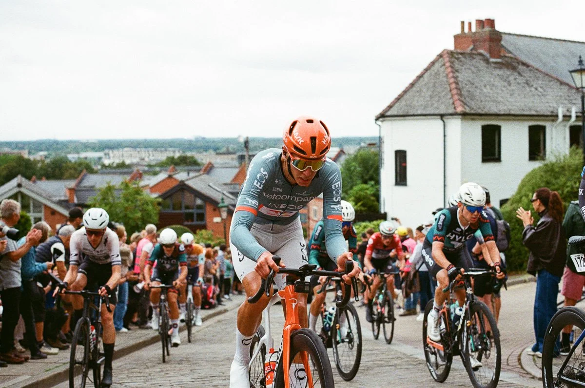
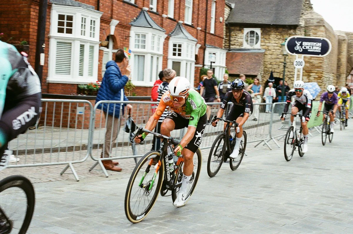
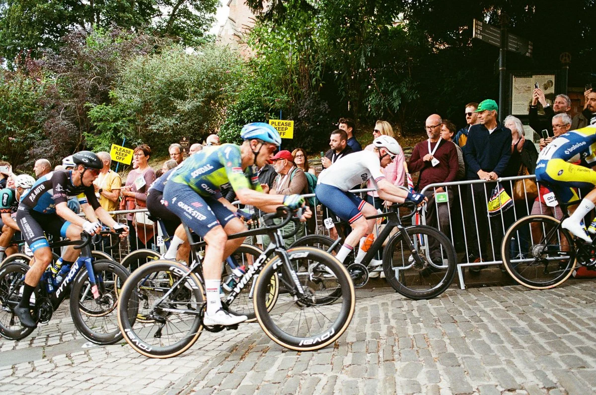
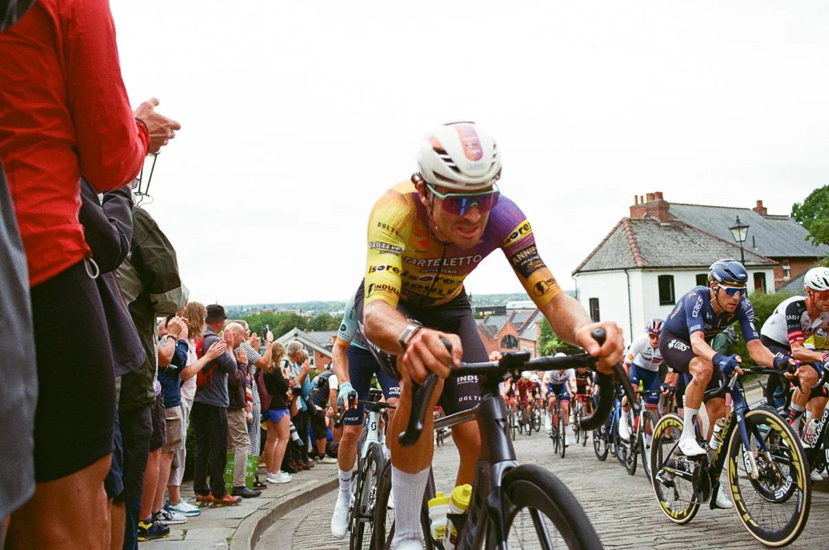
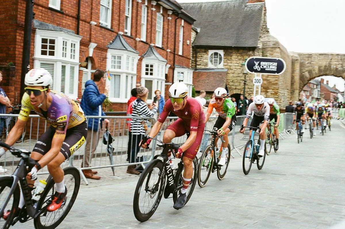
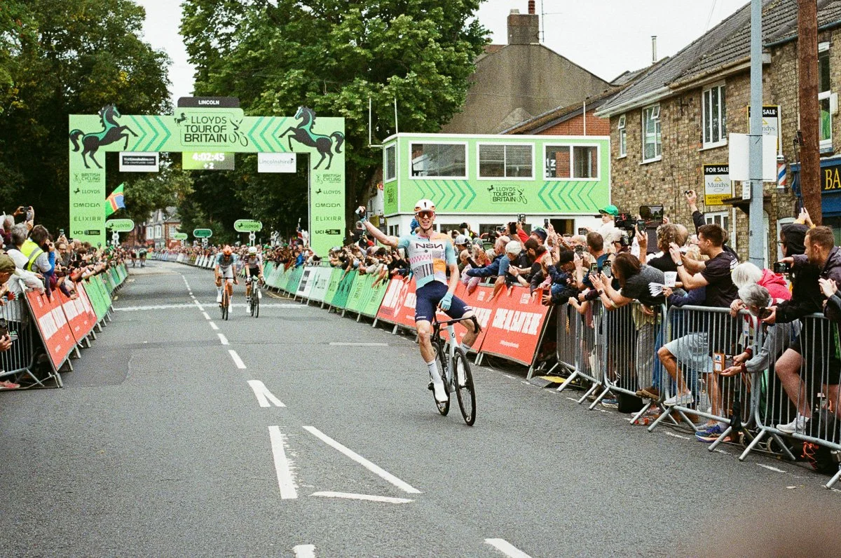
As the sky cleared, the race returned to Lincoln and crowds lined the cobblestoned Michaelgate climb, I loaded UltraMax 400 in the safe knowledge it would capture the colour and spectacle as the day came to an end.
Smooth grain, natural colours and fast shutter speeds allowed me to capture the race atmosphere but with the film’s high speed I was freezing the action rather than capturing the speed and movement.
My intention was to ‘play safe’, to try and match the quality of the images being produced by my colleagues shooting digital on day one and UltraMax certainly delivered on that objective.
The film’s exposure latitude is clearly visible in the images, retaining detail in the brightest areas (sky) and in hindsight I would happily have exposed the film by an extra stop to really boost the vibrancy.
I’m left with a lingering question however, is KodaColor 400 too safe? When scanned and shared on social media do the images reflect film photography or are they too close to a digital camera’s output?
Day 2 - KodaColor 200
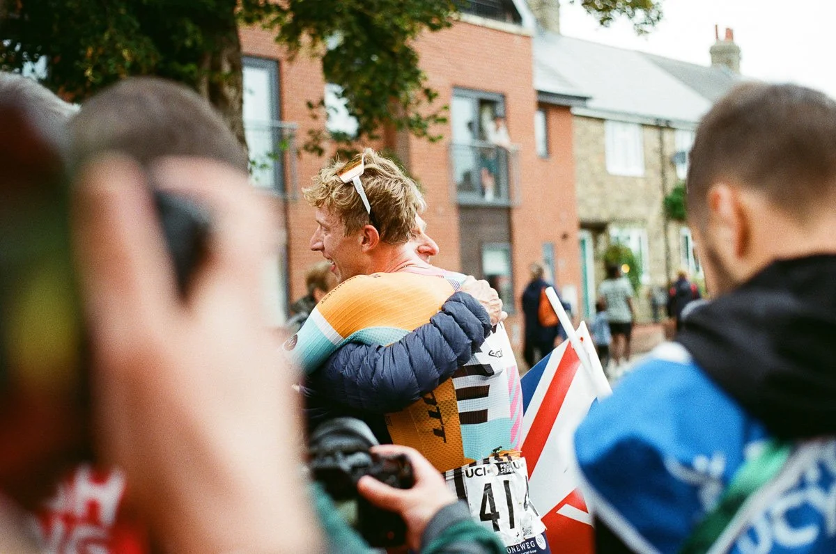
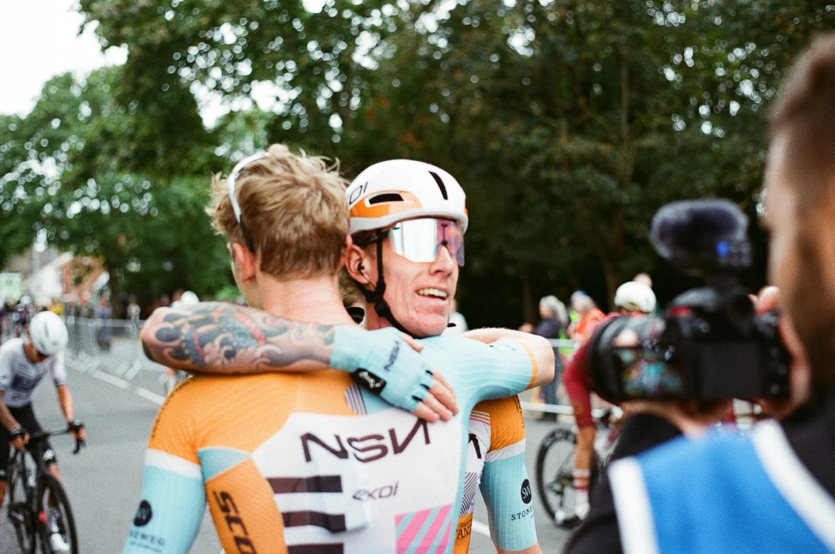
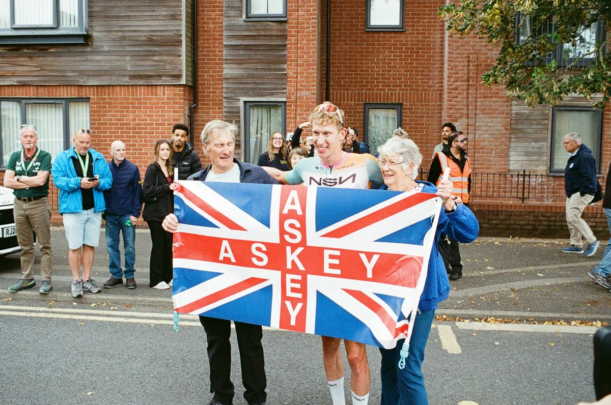
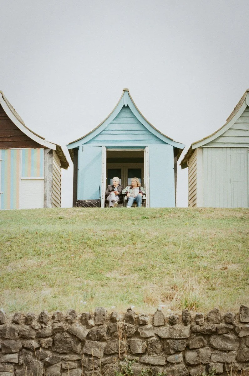
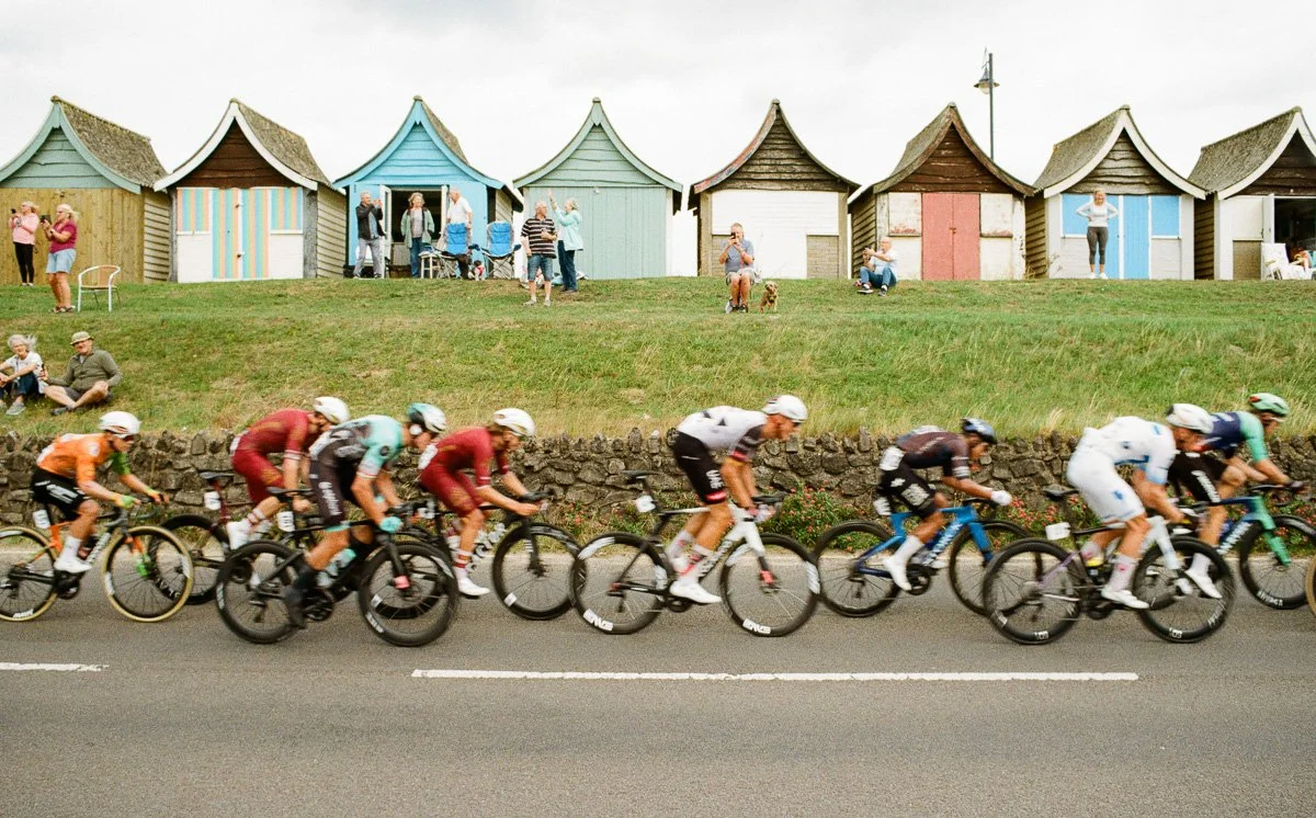
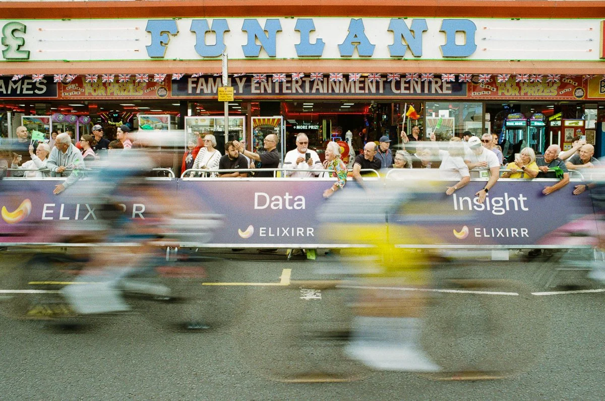
Confident in the weather forecast and the available ambient light on day two I headed to Boston with just two rolls of KodaColor 200. After the race left the town centre I had two shots visualised; the race passing the iconic beach huts in Mablethorpe and finishing in front of the ubiquitous arcades in Skegness. For both planned images I wanted to slow my shutter speed and the slower 200 ISO film speed suited this plan when compared against yesterday.
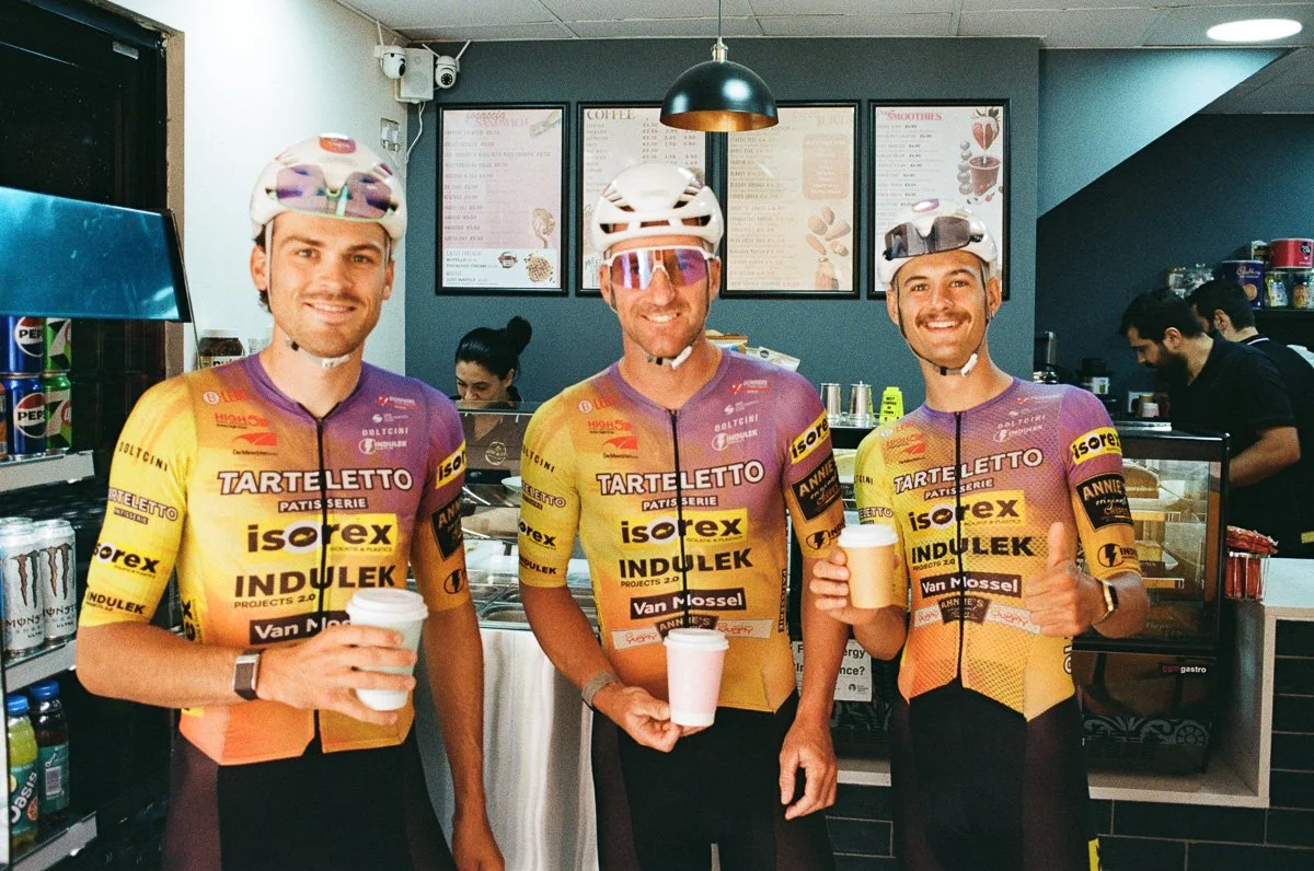
KodaColor 200 is very much the slower sibling to UltraMax and the only surprise is the latter having retained it’s ‘unique brand’. I’ve always found KodaColor 200 to be reliable and forgiving, handling most lighting conditions with ease, and only tripping up when the light deteriorates. Even then however, as with my shot of cyclists inside a dimly lit coffee shop, carefully exposed the film handles everything thrown at it. Again the outside shots retain detail in the sky and the colours are bright and true in all situations. As you’d expect, grain is fine and smooth.
The slower film speed allowed me to shoot at the planned slower shutter speeds, 1/60th sec for the beach huts and 1/30th for the arcade and retain all the quality of film shot on vintage cameras. I’ve printed several of these images up to A3 and the grain and texture are spectacular.
Whilst KodaColor 200 and UltraMax 400 are ideal films for reliable, natural results, when I review my images in detail I feel the former retains a unique analogue quality that the latter looses.
Day 3 - KodaColor 200 and Kiki Pan 320
Day 3 was an opportunity to build on what I’d learned over the previous days, see if I could push the KodaColor 200 a little further and discover the Kiki Pan 320.
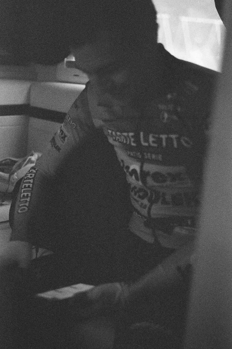
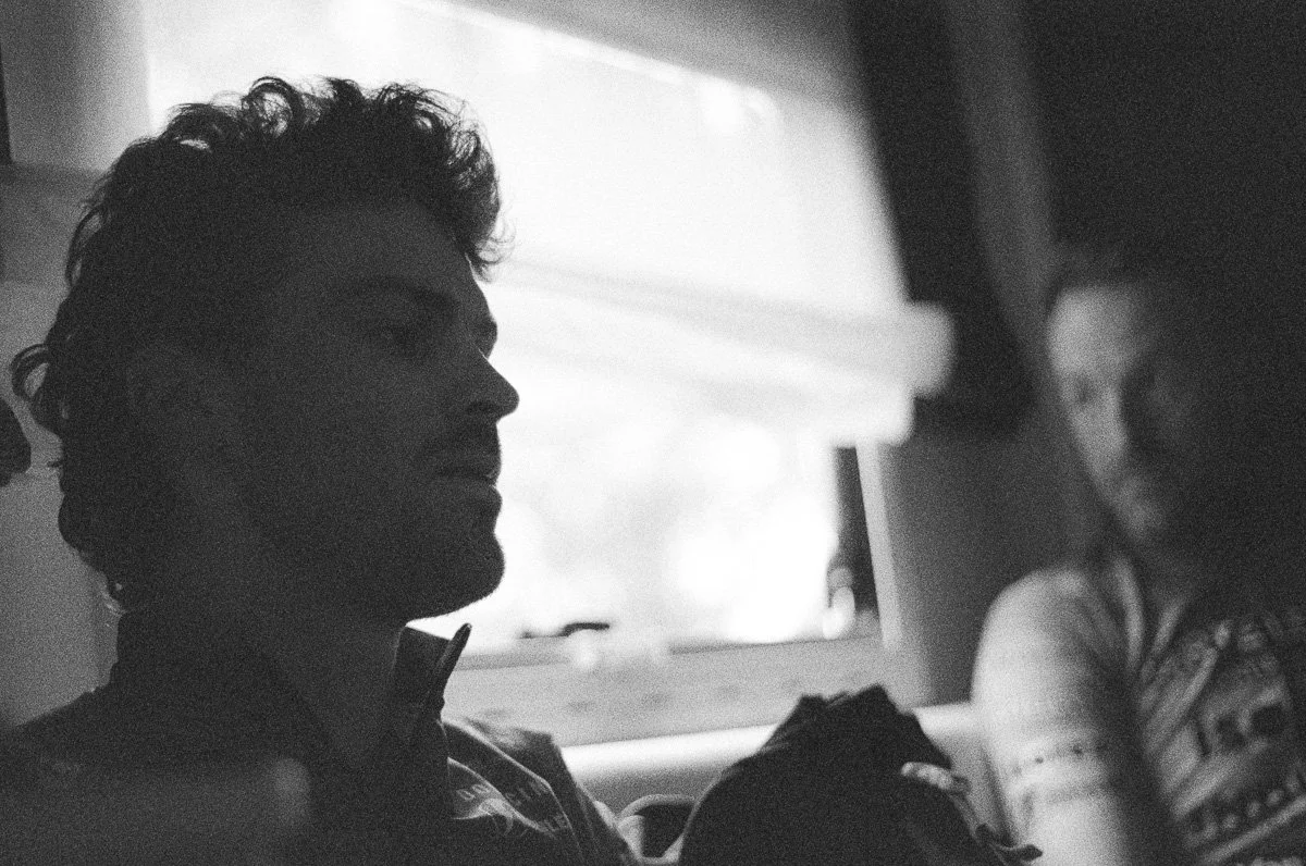
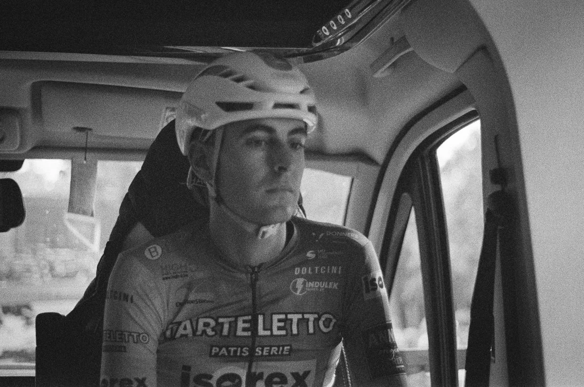
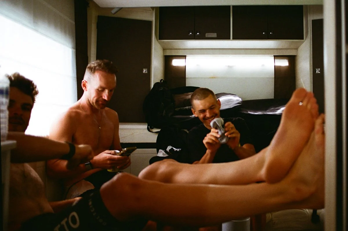
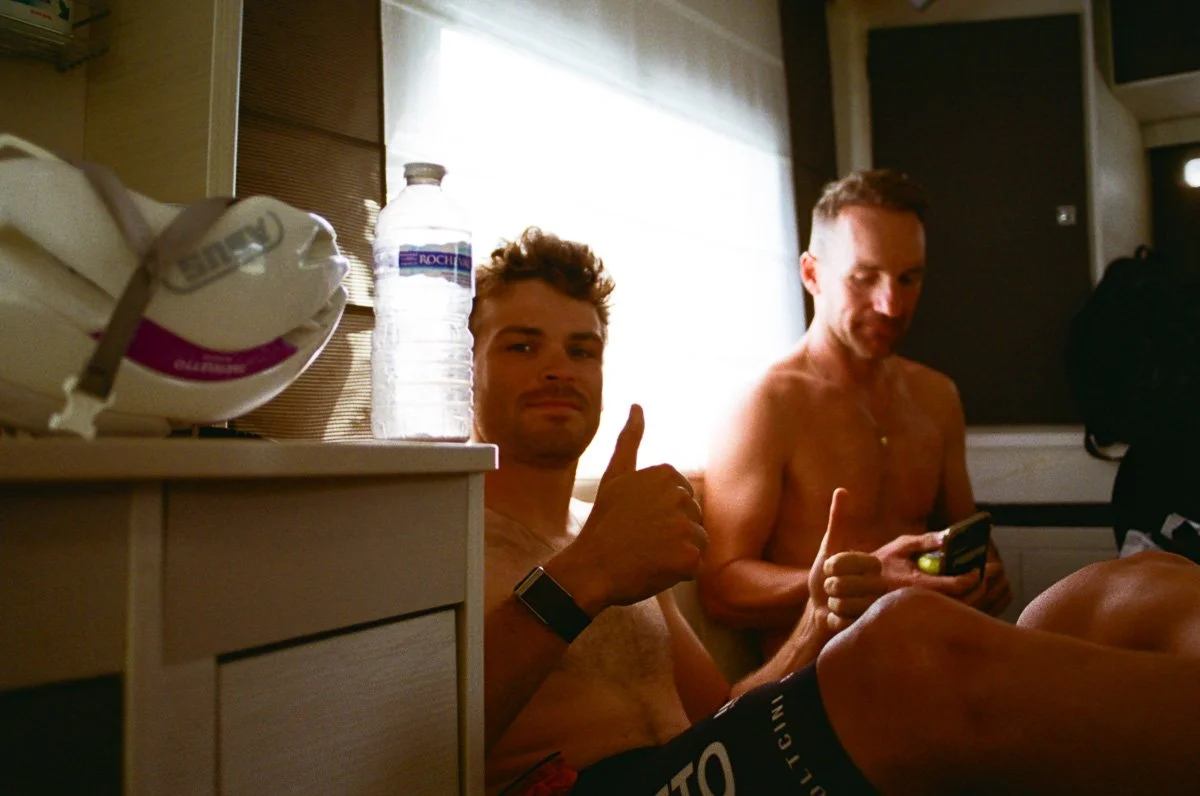
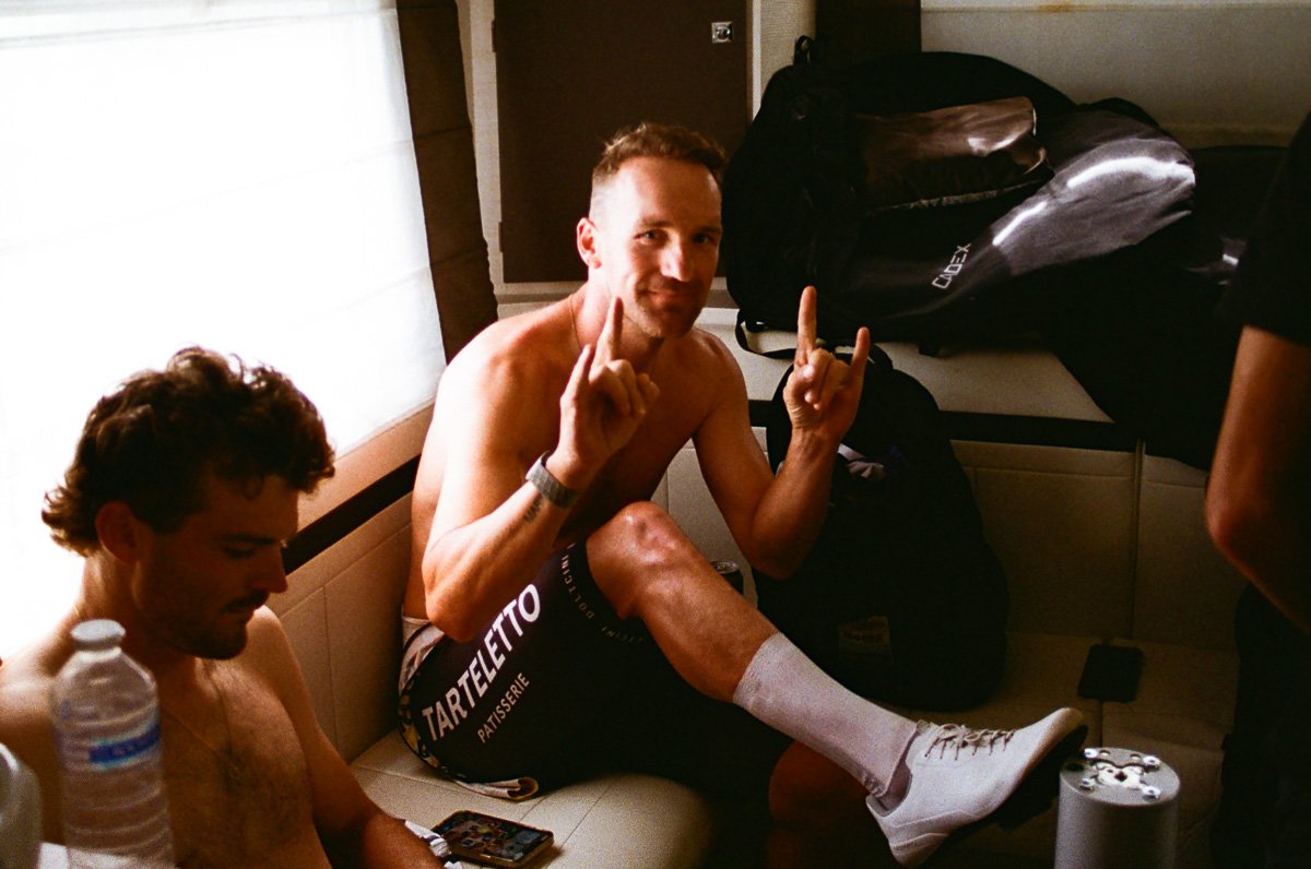
My first opportunity was to test the Kiki Pan in the most difficult conditions as I was invited onto a team bus to shoot the riders I’d caught in the coffee shop the previous day. With little natural light I feel the film struggled even when I pushed manual exposure as far as I dared. At the end of the day I shot the same environment with the KodaColor 200 and although I have some camera shake, shooting at 1/15th sec, the colour film captured more detail.
Shooting the Kiki Pan 320 outside in natural light produced an improvement but I was left feeling the strong grain overwhelmed any unique character the film offered.
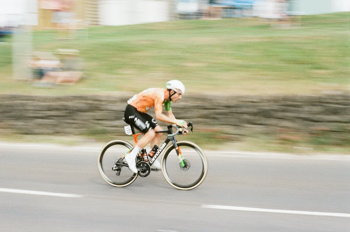
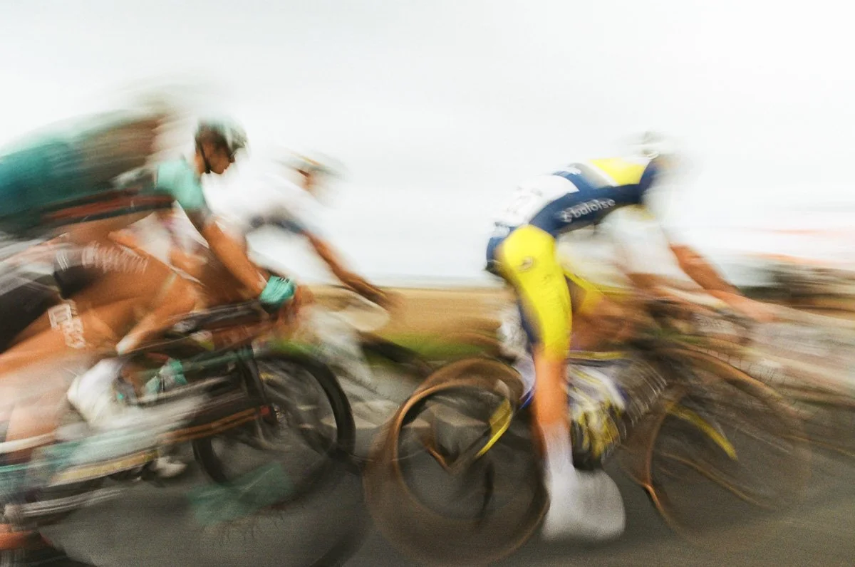
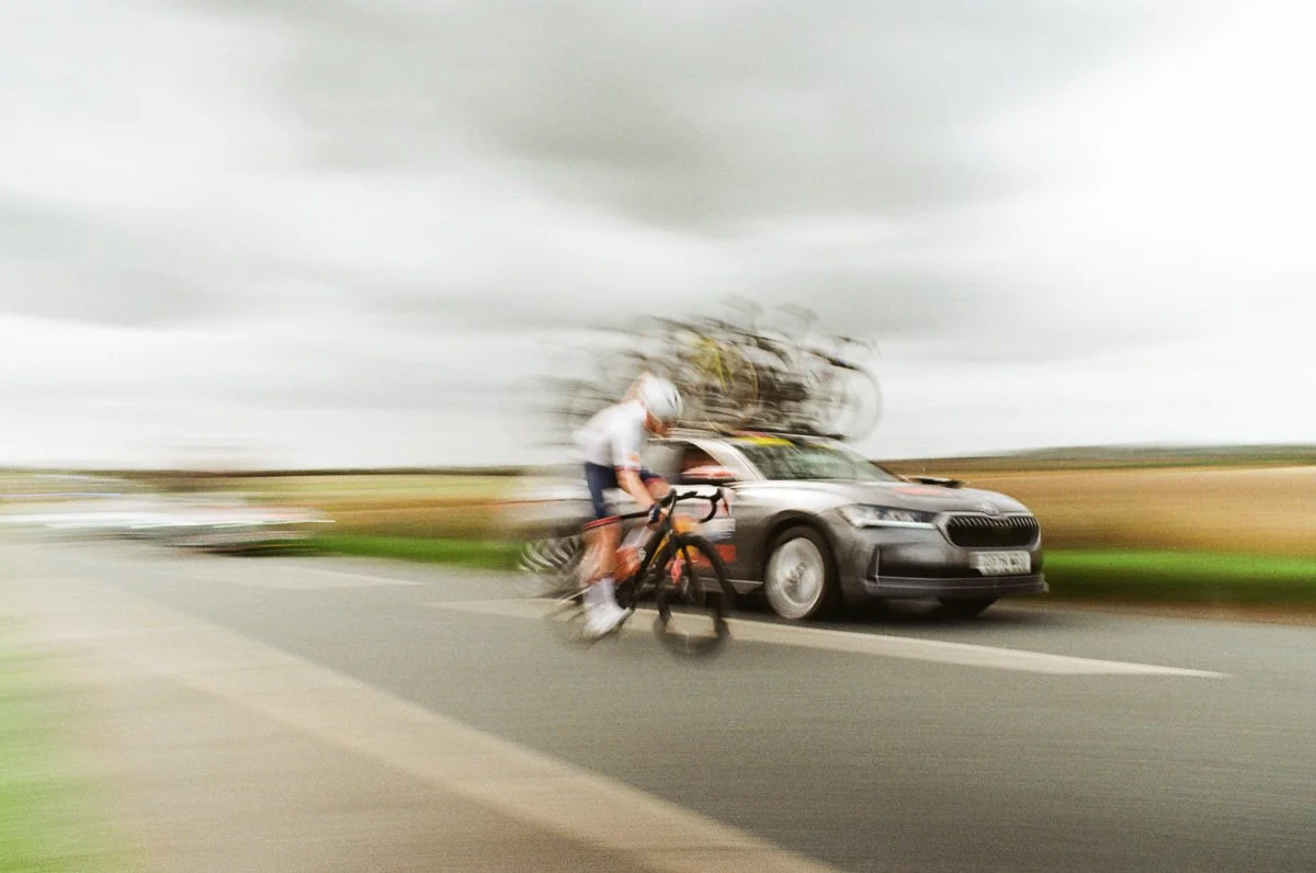
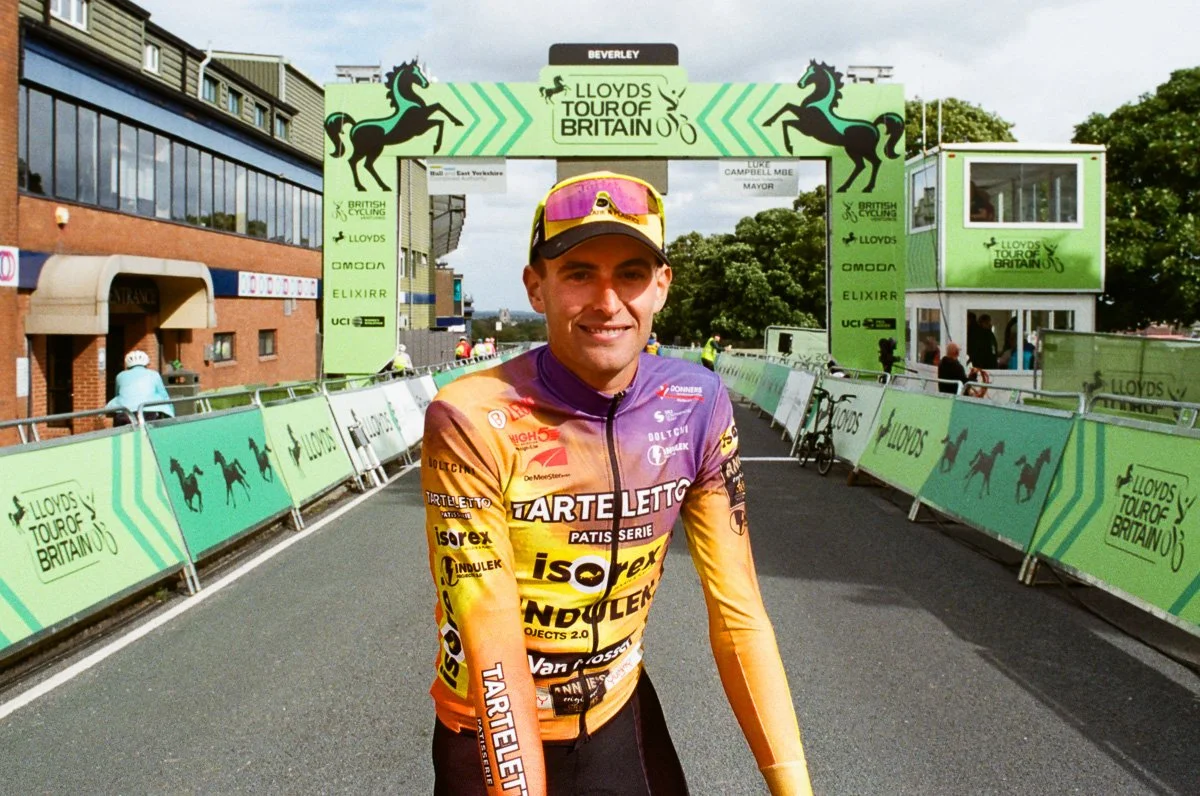
To push the KodaColor 200 I headed out to a clear, straight stretch of road with good sunlight from behind me and fitted a variable neutral density (ND) filter to my 25mm lens. Shooting a fast moving subject at ½ sec is counter intuitive on a film camera as you feel you have no control, but I was delighted with the results, capturing the movement but especially the bright colours and the chaos of the moment. Again the reliability and predictable quality of the film allowed me to concentrate on the shot, the only change I might make (again) is to compensate with some positive exposure adjustment.
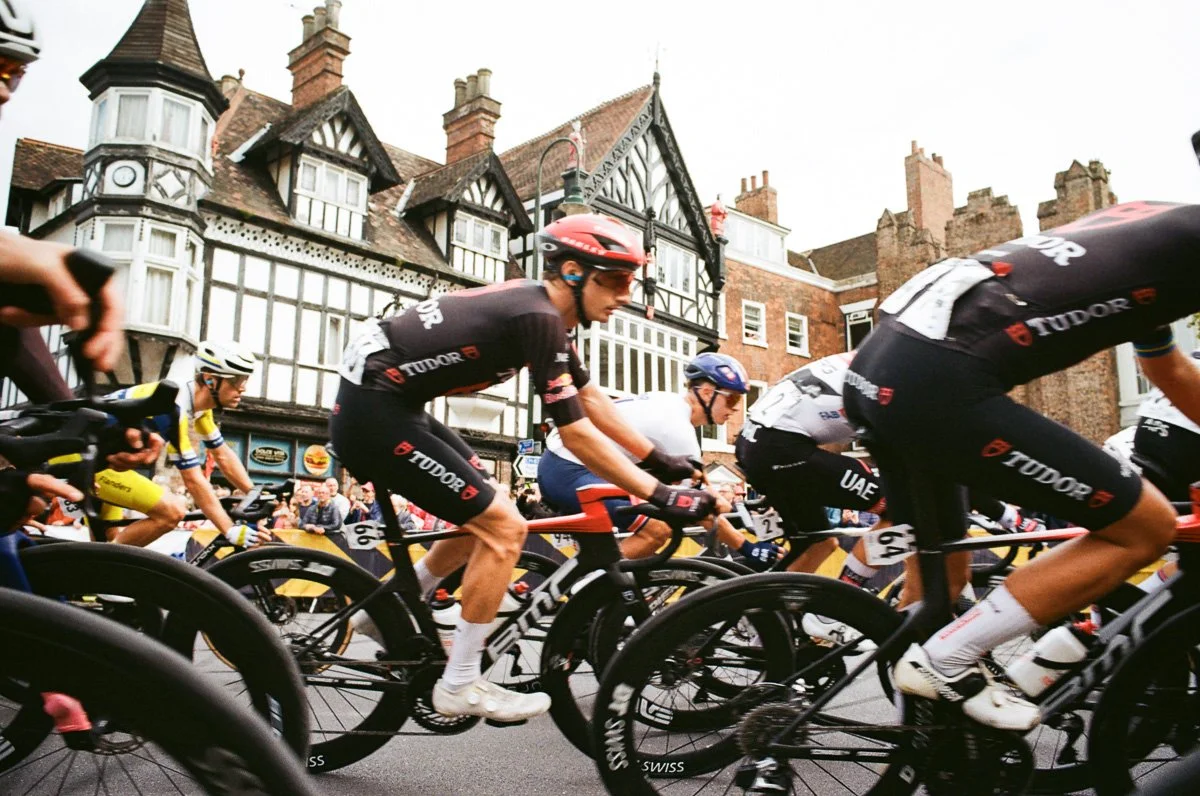
As a contrast I then captured the fleeting moment of the peloton passing at full speed, only centimetres away, at 1/1000th sec with the same detail and quality.
Whilst I’ve discussed my confidence in the KodaColor films, personally I’ll forgo the Kiki Pan for the softer, smoother Kentmere Pan 400 or distinctive Ilford HP5 when I shoot black and white in future (sorry Ross!).
What Did I Learn?
Discussing film choices with Ross ahead of the shoot I recognised the opportunity to match film not only with the overall subject but with the individual situations, times and locations I encountered.
As I mentioned in my introduction the resurgence in film photography has resulted in film choice being clearer, in that the individual qualities of a film have become important, film is being used for creative image making, not necessarily just to produce ‘the best’ images.
As a fan of black and white photography I’ve surprised myself at just how much I’ve concentrated on and shot the colour in this project. Whilst the colour of bike racing is a big element and one I planned for, I think we take colour in digital photography for granted, the saturation slider is doing little for creative development.
Film renders colour differently, and the way each individual film handles colour is probably it’s principal, visual characteristic, what sets it apart. We can analyse individual colours and shades but film creates a mood, happy and vibrant, sulking and downcast, edgy and unpredictable, dark and brooding.
Shooting a project with different films needs a theme or thread to run through those characteristics. Even if the moods change the personality needs to remain.
So how would I choose film next time?
New film is being produced all the time with unique characteristics to make it stand out. Speak to an expert, Ross at Not Quite North, to discover something new, a new mood to shoot
A selection of different film to shoot individual moments has significant logistical and financial challenges, next time I’d choose two, or maybe three for a multi-day project
Despite the plan and detailed preparation, photography is all about moments, the unexpected. A film you know and trust will help you respond quickly
Set a style, make a harmonised choice
Be confident in the decision, stick to the plan and shoot to the style
It’s a personal, subjective choice and it’s really not clear cut. But two film stocks stand out for me as a cohesive pair;
KodaColor 200, the dependable, safe choice but still with the look and feel of ‘analogue’. 200 speed film for daylight but slow enough to need to keep an eye on the exposure. Natural colours and contrast, with the potential to get creative.
Metropolis, I think is a good partner for the KodaColor, even if I need to work with it a little more. Alongside the KodaColor it pushes the characteristics to that grungey mood, sharpens contrast, roughens the grain and shifts the colour to a darker palette.
If I were to pick a third it would be black and white, and following the thread of the first two it would have to be Ilford HP5, picking up the contrast and grain of the Metropolis but picking out the texture and structure of my shots rather than any colour.
What Would You Choose?
Ask me in a few weeks and I might change my mind, I might feel the KodaColor is too safe and/or the Apollo needs a second chance!
What film would you choose, why?
How would you combine two or three different films?
What characteristics do you look for in analogue photography?
Let me know your thoughts below. Have questions, leave them in the comments and I’ll (try to) answer them.